As one of the first domain and web-hosting providers in Canada, Rebel.com had built a successful business without overly investing in its brand. But the internet took off, and so did the competition, threatening the company’s trajectory over time. To continue to grow both domestically and globally, Rebel needed a glow-up that played to its strengths.
Insight
Where others compete on size, price, or AI-powered features, Rebel has always been known for its relationship-driven service and support. We saw an opportunity to position Rebel as the partner that shows up in an industry that forgot how, helping you get online and get ahead, without the headaches. It was time to flip the script on what it means to be a Rebel.
Action
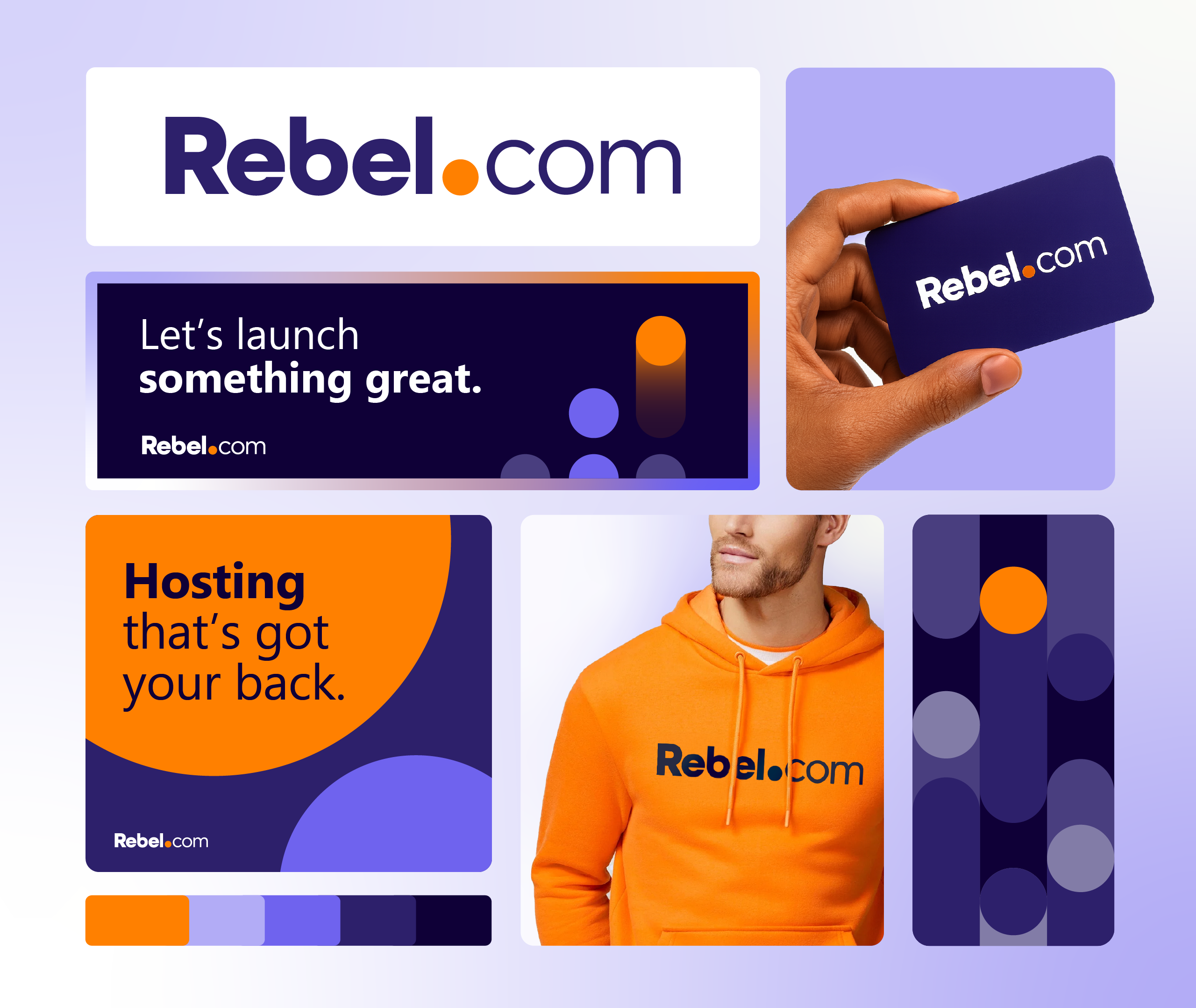
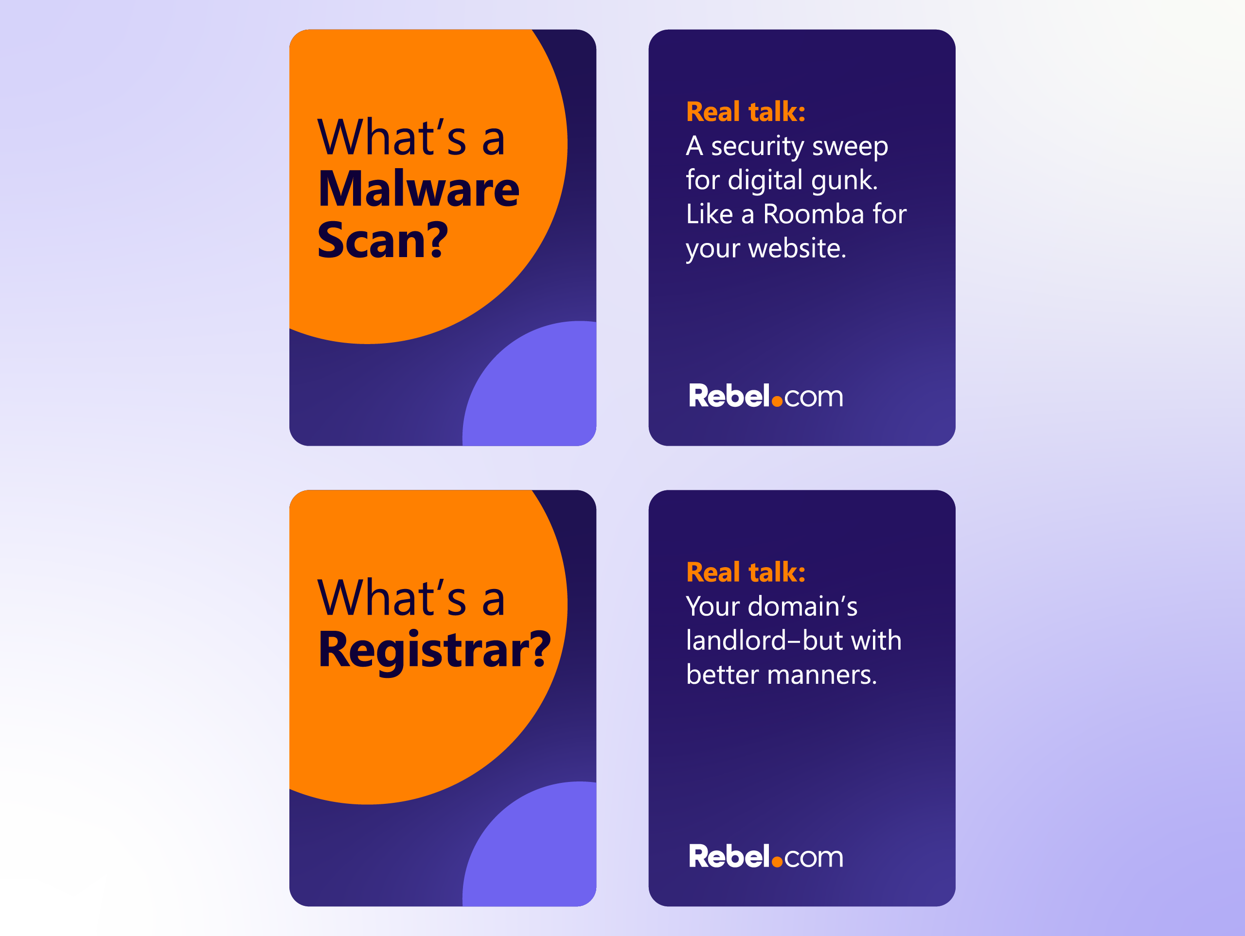
The new Rebel brand balances sophistication with a tone of voice that embraces its name. The visual system centers around the dot in the logo – a symbolic shorthand for all aspects of the business. With a clear positioning and creative identity, Rebel’s new brand proves that it’s not another sleek but soulless platform; it’s a globally relevant company with a proudly Canadian soul – a partner that gets you, to get you where you’re going.
Clear Results
Here’s how clarity came to life as a modern and meaningful brand.
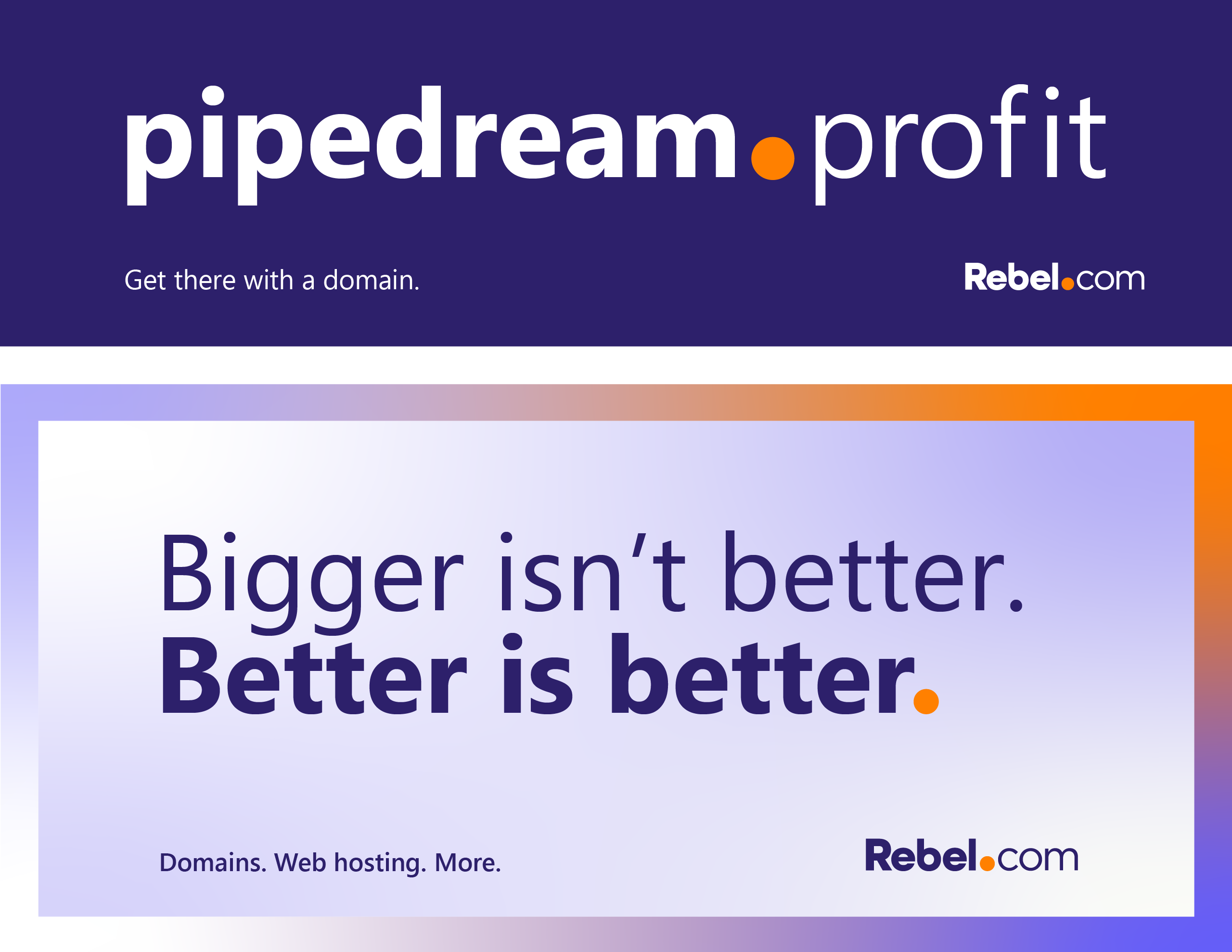
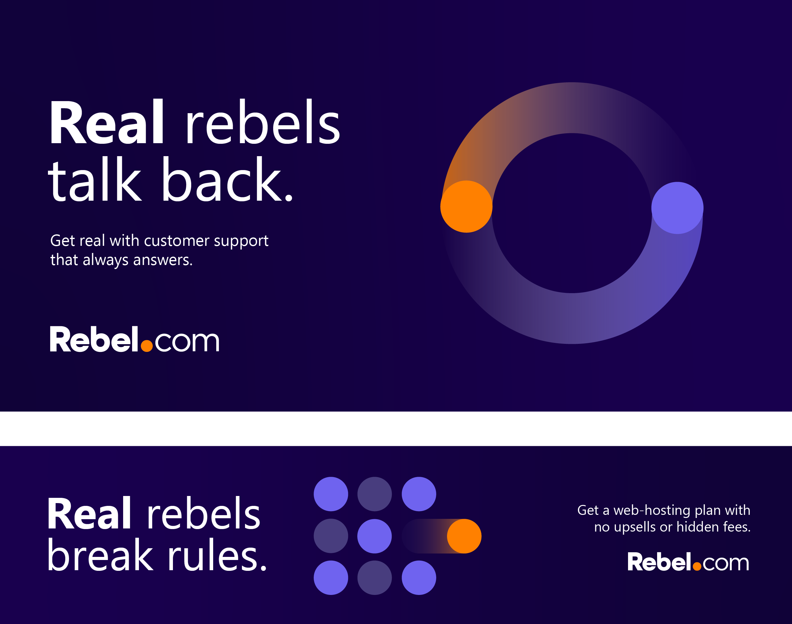
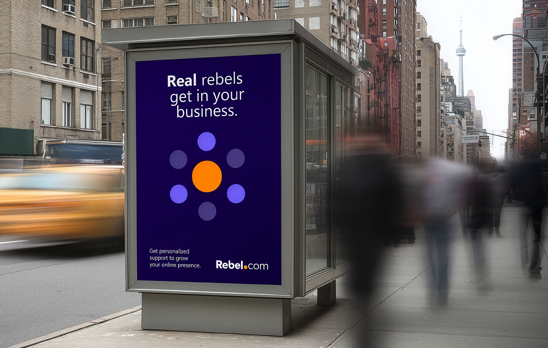
A new positioning, value proposition, and messaging platform grounded in sincerity and human support.
A boldly evolved, differentiated visual identity complete with brand guidelines and motion expressions.
A creative concept to activate the new brand across multiple channels, redefining what it means to be a rebel.
“S3 McMillan cracked a tough brief and gave our SaaS brand a real voice. Their sharp, nuanced copy became the strategic backbone, and the execution was disciplined and gorgeous. Great brands are made by great humans with this level of craftsmanship.”