Brand Strategy
Concept Development
Logo and Design System
Manifesto Video Campaign
Display Advertising
Digital Assets
Years of rapid growth through acquisition had left HUB International with a fragmented, dated brand experience. It was time to align the brand with the scale and momentum of the business, driving market performance and unifying internal teams around a more powerful, modern presence.
When we looked closely at HUB’s audiences, we saw a key connection. Both the company’s target customers and many of its brokers shared an entrepreneurial mindset. This insight became the strategic throughline to reposition HUB as a brand built to empower entrepreneurs and drive business success.
S3 McMillan developed an agile, digital-friendly brand platform anchored in entrepreneurial energy. We delivered a refreshed brand identity, a robust suite of creative assets, a redesigned HUB website, and three go-to-market campaigns – helping HUB activate its new brand and accelerate business growth.
growth in site traffic after launch
new leads in the first 90 days
Continued YOY revenue growth and marketing performance since launch
The customer is the center of HUB’s world and the blue roundel is the bold visual interpretation of that customer-centric ethos. It spotlights clients, surrounding and protecting them, placing them at the center of the new brand.
The expression of the roundel in a dot matrix pattern represents HUB’s network of expert brokers. It sits in the background of photography and text layouts, backing up the brand messaging.
The system uses heavy line weights and confident curves that encourage trust in the company’s expertise. And when deconstructed, the system provides a set of graphic devices that advertise the company’s global reach.
The appropriately organic color palette rests on a brown as deep as the earth and a vigorous ochre that pays homage to the bronze of antiquity.
The customer is the center of HUB’s world and the blue roundel is the bold visual interpretation of that customer-centric ethos. It spotlights clients, surrounding and protecting them, placing them at the center of the new brand.
The dot matrix expression of the roundel—along with the dot matrix pattern—represents HUB’s network of expert brokers. It sits in the background of photography, literally backing up the brand.
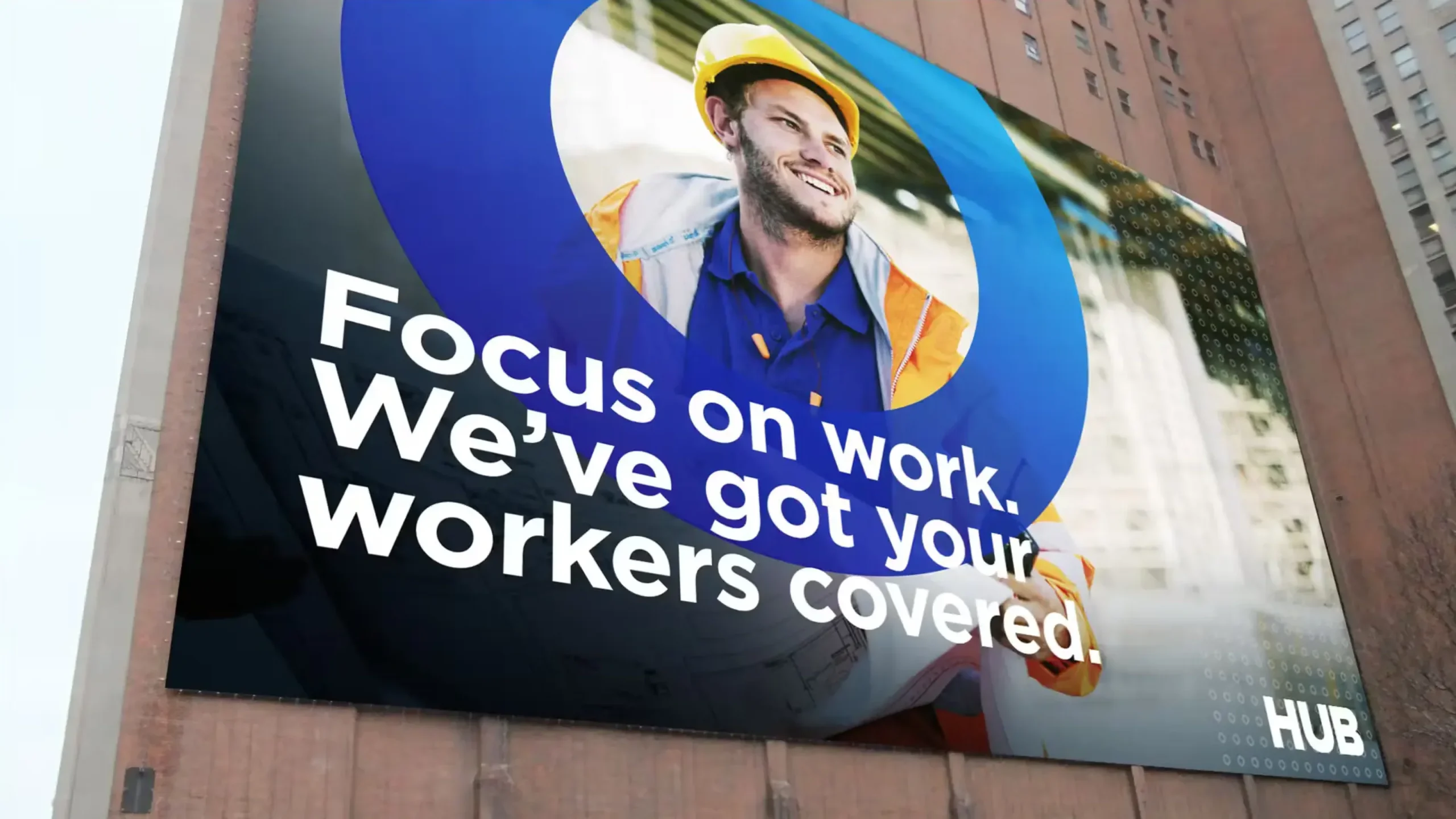
To solidify the new HUB brand in the marketplace, we expanded into demand generation campaigns, social media, and brand videos. And when HUB added retirement planning to their offerings we created a video sequel that positioned the brand right alongside their clients—ready for tomorrow.