For more than a century, the Canadian Pharmacists Association (CPhA) had been a vital force in healthcare. Despite their innovative work, however, they were still perceived as a dated publishing company. It was time to shift that perception – and showcase CPhA’s leadership in advancing pharmacy and patient care.
Insight
CPhA’s impact stretched far beyond publishing. They helped healthcare professionals connect, collaborate, and drive innovation. The opportunity: tell a modern, unifying story that would resonate across healthcare stakeholders, while elevating CPhA’s role as a forward-thinking leader.
Action
S3 McMillan aligned CPhA’s advocacy and business value propositions into a single, overarching brand story. We then built that into a flexible brand platform that could grow with the organization – and developed a fresh visual brand language that instantly conveyed clarity, credibility, and impact.
Clear Results
Here’s how brand clarity delivered business-driving impact:
Repositioned CPhA as a modern healthcare leader
Unified advocacy and business narratives under one cohesive brand
Equipped CPhA with a flexible, scalable brand system for continued growth and diversification
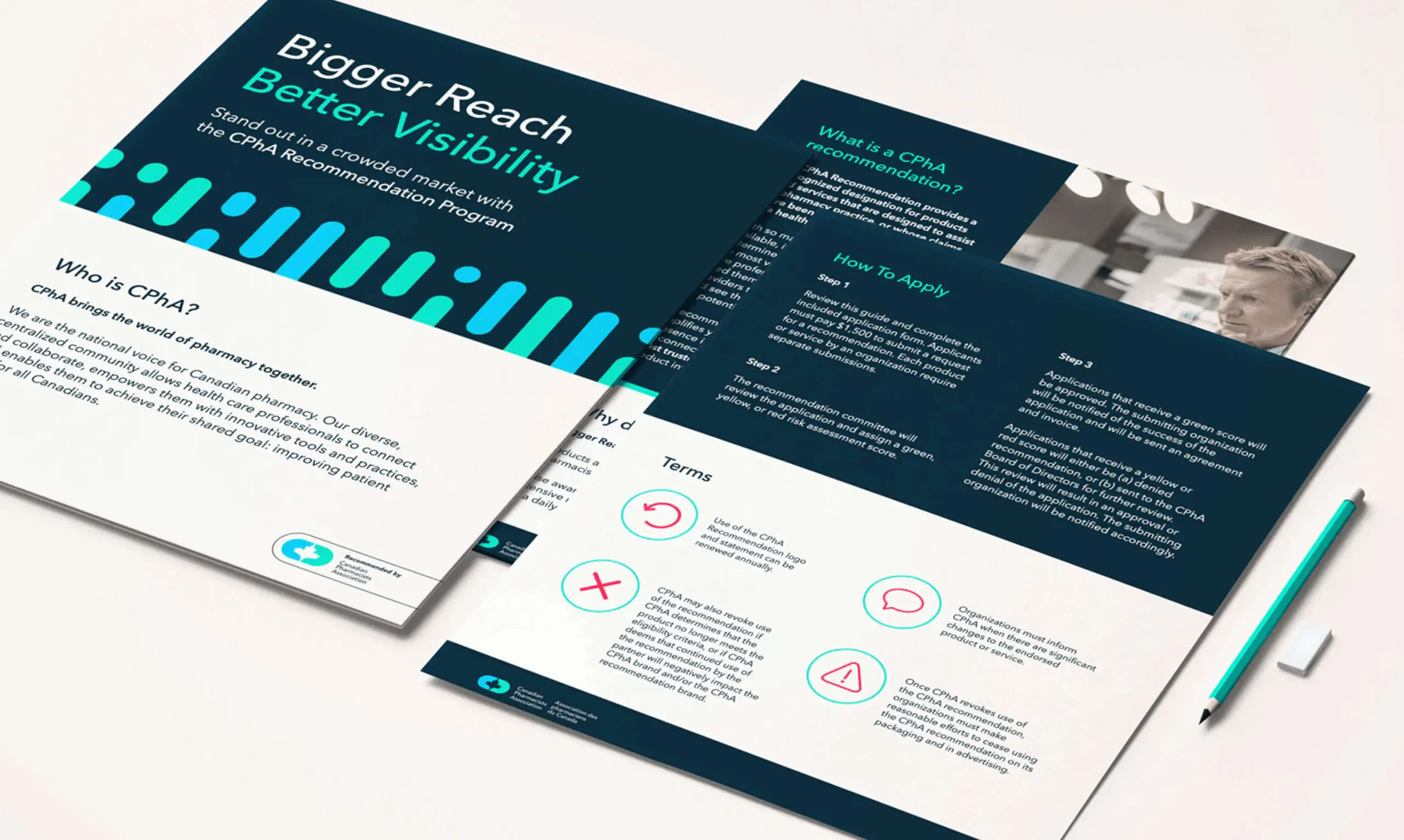
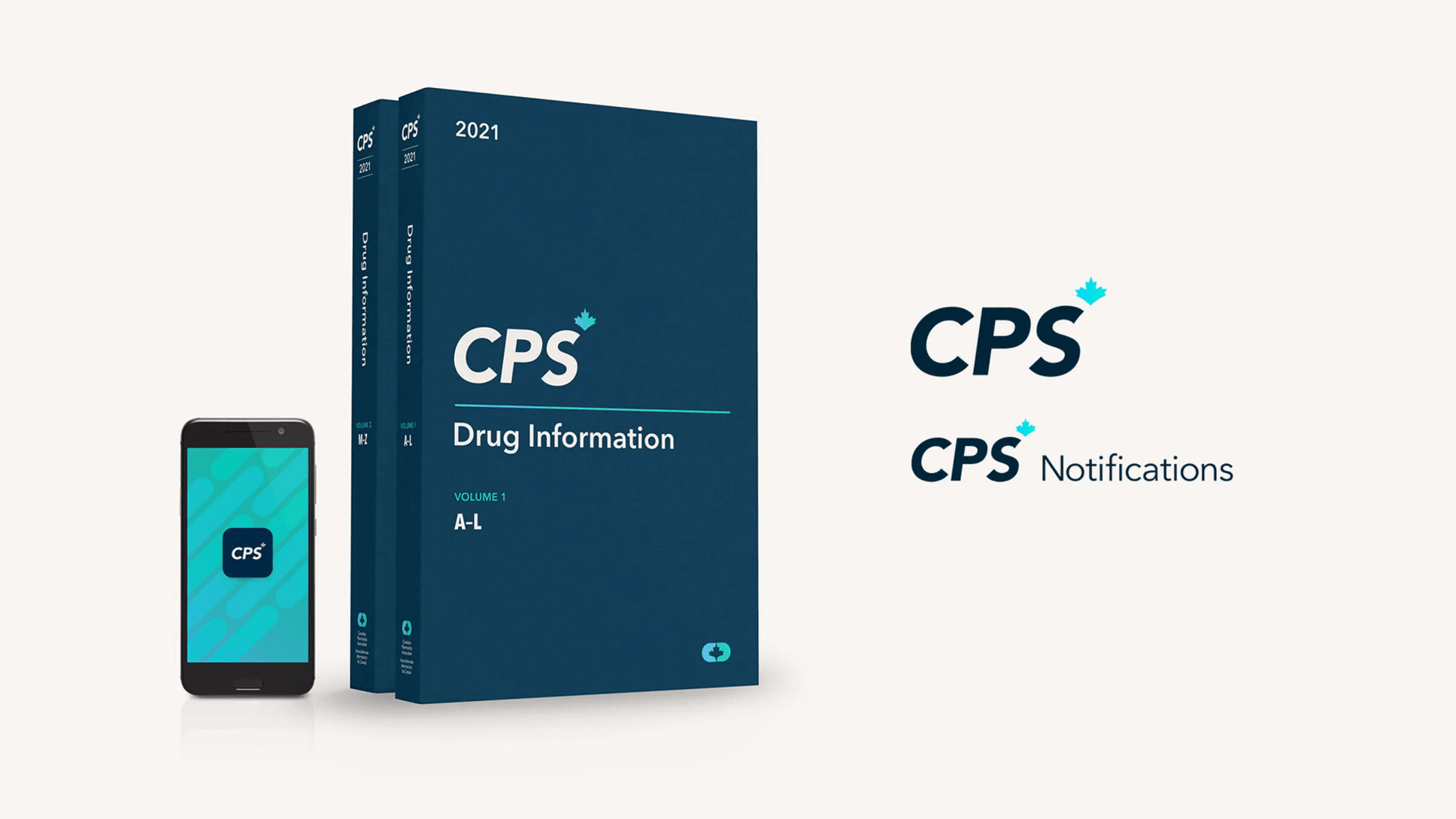
The Brand Design System
LOGO
The new CPhA logo visually brings the world of pharmacy together. Two distinct halves are linked by a negative-space maple leaf – a nod to Canada and a symbol of the partnerships and collaboration CPhA fosters across healthcare.
BRAND DESIGN
Inspired by the capsule shape of the logo, the dynamic design system signals innovation while staying rooted in the world of pharmacy. Clean patterns and a modern color palette balance authority with approachability – helping CPhA stand out and communicate complex ideas with clarity.
BRAND DESIGN
Inspired by the capsule shape of the logo, the dynamic design system signals innovation while staying rooted in the world of pharmacy. Clean patterns and a modern color palette balance authority with approachability – helping CPhA stand out and communicate complex ideas with clarity.